
My color swatches project in process
February 7, 2019
I’ve been working on my color swatch project for seven weeks now! The idea behind the project is to help me establish a solid foundation of color knowledge and to teach me how to mix colors well. Ultimately, I want the color in my paintings to feel vibrant and professional. The result of this in-depth study is a master set of swatches that will be an invaluable resource to reference when selecting pigments for a color palette or for a particular color.
You can read the background of this project in my previous post.
In this post I will share practical details on the supplies that I’m using and my process for making the swatches.
Supplies & Preparation
12 colors plus Titanium white (See my color selection here.)
Canvas sheets. I used a 12×16 pad (cut each in half)
Quarter-inch white tape
Thick white tape or blue painter’s masking tape
Exacto knife
Ruler
Cutting board
Mounting board
2 small palette knives

Before I took out any paints, I designed a template for the swatch sheets in Adobe Illustrator. I printed the template, taped it to a board, taped a cut canvas sheet over that, and taped off the rectangles with quarter-inch tape and blue painter’s tape. (Feel free to use my template by downloading it here.)

To mix the paints and to paint the swatches on the sheets, I use a palette knife for fast results and easy clean-up. Actually I use two palette knives. One for mixing the colors and one for picking up white only. That way I’m not constantly cleaning my knife and I don’t mistakenly taint my pristine white with another color (gasp!).

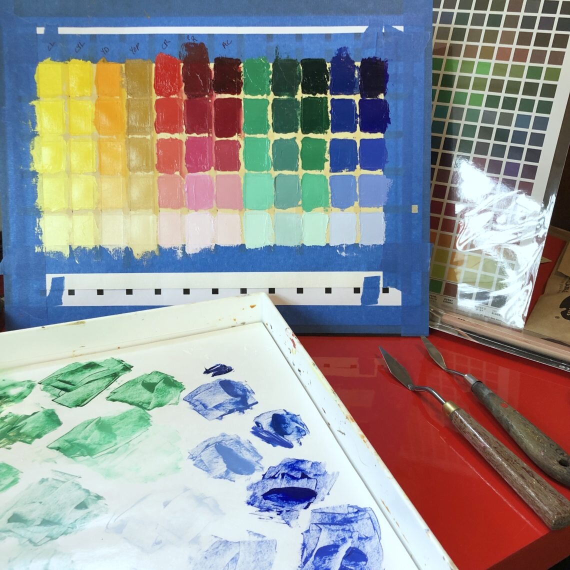
Swatch sheet of all 12 colors
The first swatch sheet I worked on is a swatch sheet of all 12 pigments. Each column represents one pigment. The top swatch is a full-strength swatch of the color straight out of the tube. The next four swatches below this are tints of the original color with subsequent swatches getting lighter as they move down the page, ending with a pastel version of the original hue.

Swatch sheets with one color as a base
Next I’m creating a swatch page for each of my 12 colors as a base. These swatch sets illustrate how the base color is affected by mixing with each of the 12 colors. The idea is to mix enough of the second color into the main color such that the mixed hue is still within the original color family. For example, when I added Permanent Rose to Cadmium Lemon, the final color was a version of yellow, not an orange. As soon as the mixed color can be labeled an “orange”, I add yellow back into the mix until I get a yellow again, not an orange.
Also, I always mix a large enough amount of the mixed color so that I can take a bit of the original mix, add a little white to make the lighter versions of the color mix. That way I get a true set of tints for that mix of colors. I learned that I get my best tint results when I take a bit of the original mix, add a tiny bit of white to make the next swatch in the tint line-up. Then I mix the lightest version, followed by the remaining two colors in between. This makes it easier for me to judge how light each swatch needs to be. I try to make even steps from the full-strength swatch to the lightest. I recorded a video mixing one color set so that you can see it in action!
BTW, some of the sheets take weeks and weeks to dry! The first one I completed is still wet, and I did that one seven weeks ago!
I’m happy to have completed eight of my color sheets so far. It’s been slow going but fun to work on. Each sheet takes about four hours to complete, though some colors are harder to mix and take longer.
It’s been a fantastic experience, and I’m learning more than I expected about mixing pigments. It’s been surprising to see some of the absolutely beautiful colors that come from mixing colors I never would have thought of mixing before! And the color in my work has already improved significantly! This project is well worth the time and effort.
General Learnings
Prepared canvas sheets have a right and wrong side. Guess how I figured this out? In my 3rd swatch set I worked on the back side of the sheet since the front side was slightly stained. I thought I was being smart and neat. Uh, not a good idea! Doh! The back side absorbs the paint like crazy since it’s not primed. How I missed this detail, I don’t know. But I did. So I had to mix much more paint to get enough coverage on that set of swatches. A newbie mistake learned!
I’m learning to lean my palette knives on the edge of my palette box. They don’t rotate on the edge and they don’t roll into other paint or leave paint from the knife on the palette.
In my next post I’ll share some of the dry sheets along with my notes.