
Making color swatches using my new paints

I am obsessed with color. Ob-sessed. It’s truly been the most important visual element in my life no matter what I’m doing.
(You should see me pick wall colors. And when I say pick, I really mean, mix my own. You’d think it’s the last time I get to paint my walls by the way I obsess for weeks over exactly which hues to use. I’ve been known to mix 15 different variations of a color to get it right! LOL. Anyway, I digress.)
Color is the most important element in my paintings, too. I work tirelessly to get the colors just right in each piece. I want colors to work harmoniously and perfectly together, and I always want the colors to appear as I envision them — exactly as I envision them. I never settle for less than what my gut tells me I need.
Inevitably, I work on color A LOT and in many different ways. Last year I did an intensive study of color when I first started painting seriously. You can read my previous blog posts on the color research that I did. And, you can see the color mixing project I worked on to perfect how I mix oils.

So, this takes me to what I’m working on today. I’m in the middle of working on a painting, and the color palette isn’t working. I want it to be mostly blues and cool colors, but the piece needs color variation to give it more depth and interest. So, I need to do some experimenting as well as playing with color swatches to figure it out. This means that my painting is temporarily in time out while I figure this out.
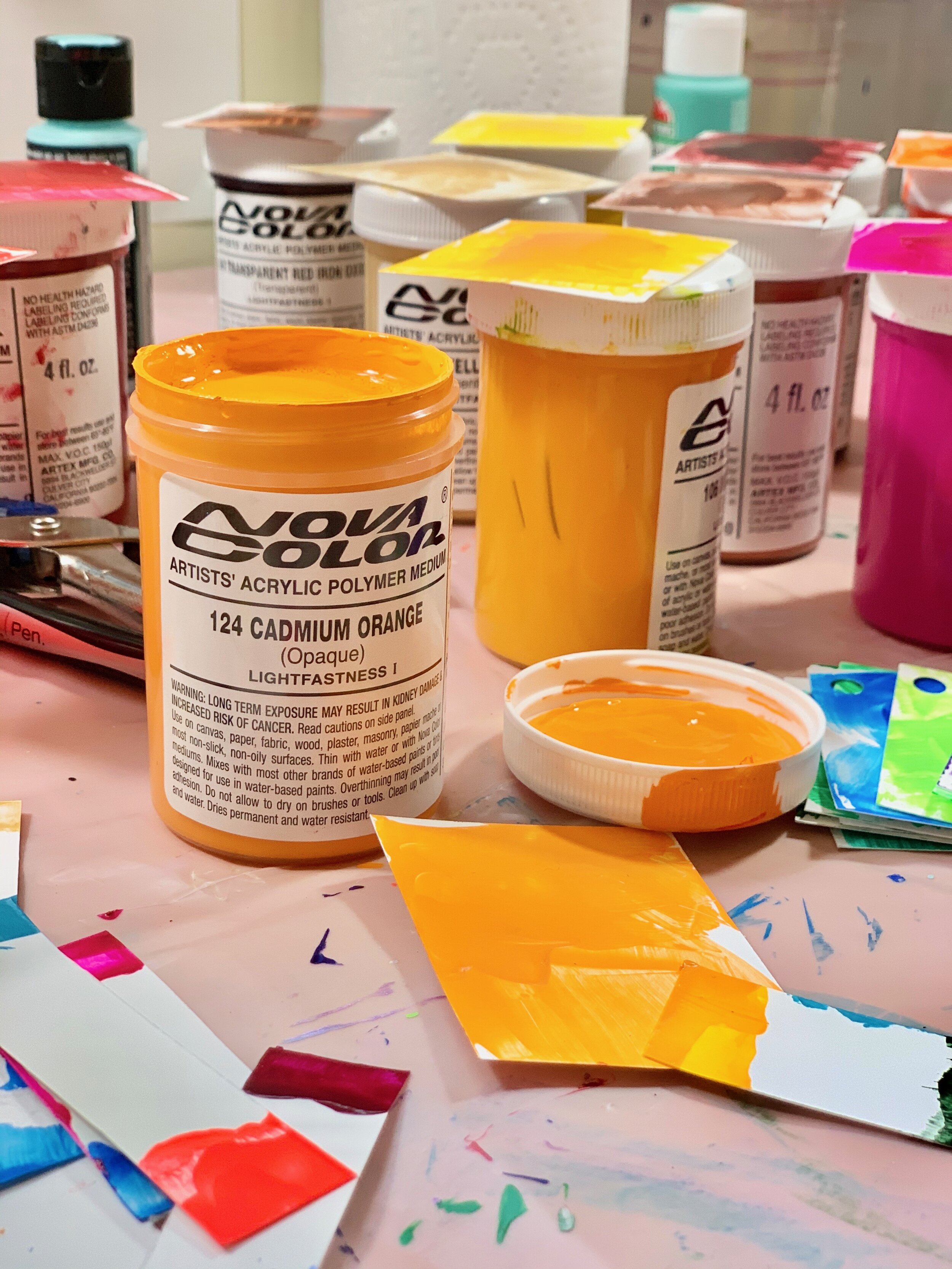
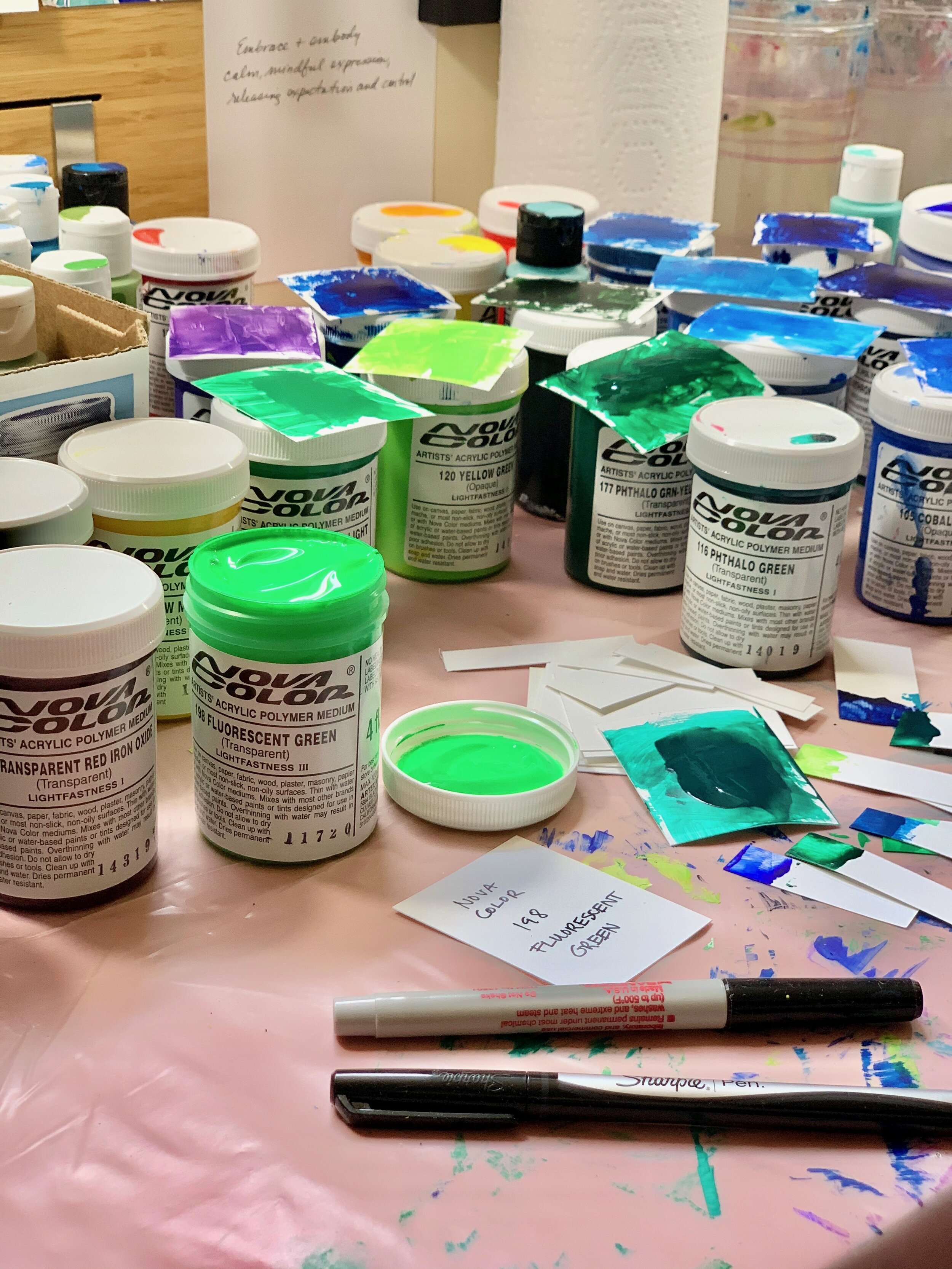
As I just bought a whole new set of Nova Color paints, and I need the right swatches to play with, it only makes sense that I make swatches of all the new colors I just bought. And while I’m at it, I might as well make swatches of the rest of my Nova Colors, too.

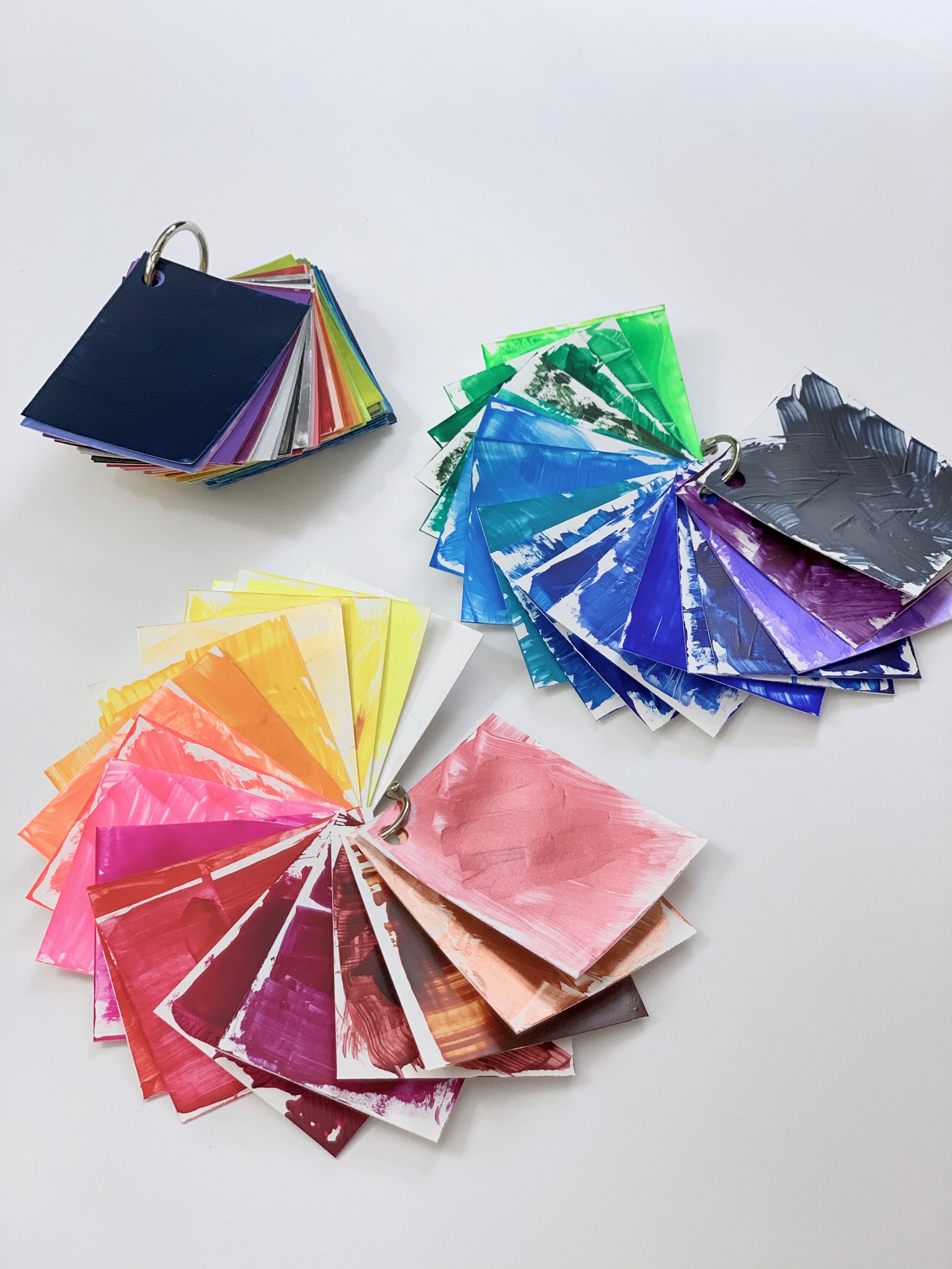
I’ve found homemade color swatches to be super helpful while I’m beginning new pieces and while I’m in the middle of paintings, when the color’s not quite right. I’ve made swatches in the past, but my new ones have improved, as they are slightly nuanced.
Previously I worked hard to make my color swatches perfectly even and solid, as any good graphic designer would do. But, I’ve learned the importance of understanding how colors look transparent as well as solid. So, my new swatches look messy, which is hard for the graphic designer in me, but I need them to show how colors appear when used as light washes as well as dark solids.
My swatch making process…
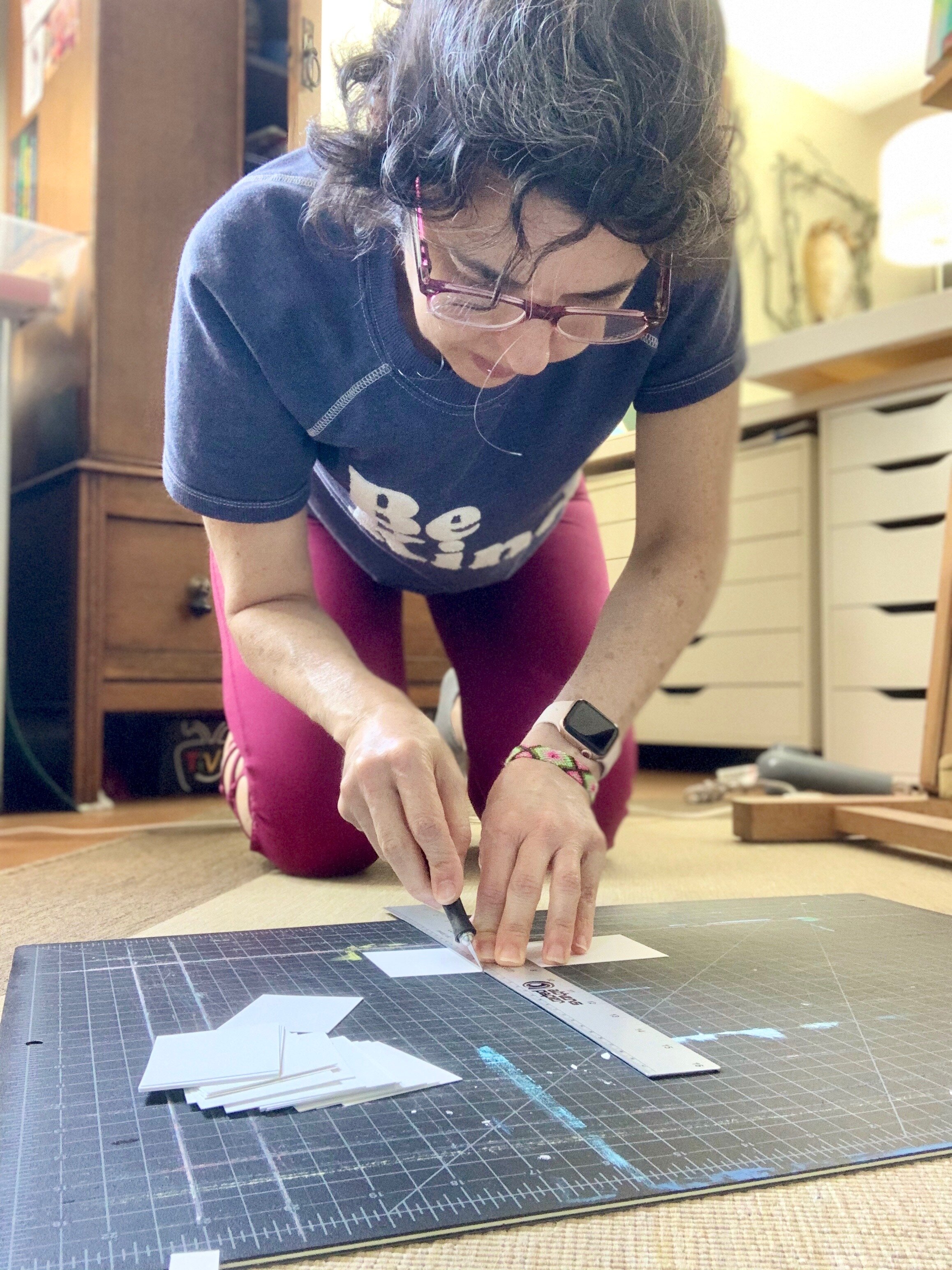
I carefully cut coated cover paper into 2” x 2.5” rectangles.
I label each with the brand and color on the back.
Then I use paper scraps to paint the colors straight from the bottles. (So I don’t have to constantly wash brushes!)
When the rectangles dry, I punch holes in each and bind them with a ring, and, of course, organize the swatches by color from warm to cool colors or vice versa. (I use either .75” metal binding rings or 1.25” rings.)
Making swatches takes time and can feel tedious, but it’s actually the kind of work that I love. I get to learn how colors work, and I produce an invaluable tool that I can use time and time again. Plus, in the end, these tools save me time while I work on future paintings.

Next I’ll do some experiments layering these colors to see how they change depending on what colors I paint on top of them. Then I’ll have everything I need to finally decide what to add to my latest piece to make the color palette work correctly.
Ultimately it can take time and lots of experimenting to get things just right, and I’m cool with that. I love the whole process of painting, not just the finished piece.
I’d love to hear if you make your own swatches and how you go about making them. Just comment below, and let me know!